Supplemental Materials:
Introduction:
This project is adapted from a Kaggle competition put on by Healthy Chicago, who offered $40,000 to the team who could best predict when and where different species of Mosquito’s will test positive for West Nile Virus.
Our Team (Team Bug Free Journey) collaborated to use the competition as a framework for a data science project. Since the competition completed in 2015, we were able to directly see our model performed in the top 20% of teams based on the AUC-ROC score of 0.74.
Our team went past the requirements and developed a methodology that could actually be used to determine where the city of Chicago should spray pesticides to protect the most vulnerable individuals. This analysis led to what I believe is the gem of this project: a Tableau map visualization making an easy to read risk of WNV by observation that could actually be used by the Government officials in real time to prioritize resources. If you’re not familiar with Tableau, check it out! Press some buttons! It’s the most fun you’ll have on a portfolio page!
Background
In 2002, the first human cases of WNV (West Nile virus) were reported in Chicago. Since, over 2300 cases of WNV have been reported in Illinois.By 2004 the City of Chicago and the Chicago Department of Public Health (CDPH) had established a comprehensive surveillance and control program that is still in effect today. Every week from late spring through the fall, mosquitos in traps across the city are tested for the virus. The results of these tests influence when and where the city will spray airborne pesticides to control adult mosquito populations. [1]
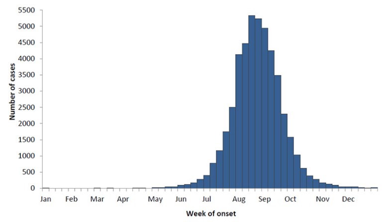
- Figure 1: Cases of WNV i in Summer Months[2]
Exploratory Data Analysis
Team Bug Free Journey was given 3 data sets from the city of Chicago
- NOAA weather conditions (years 2007 – 2014)
- GIS data from pesticide spray efforts by Vector International (years 2011 and 2013)
- Mosquito trap surveillance test results (2007 – 2014)
Before creating a model, the data must aggregated be aggregated and “cleaned”. Usually, missing data was accounted for by adding a text. This data was converted numerically using averaging, nearest neighbors. We managed to keep every observation by making reasonable inferences for missing data. We developed an interactive Tableu vizualization map of all the test locations by year. and month.
We were given spray data from GIS. The image below is an aggregation of the spray data and all the locations from 2013. The city of Chicago covered a huge area with pesticides, and the effect on the effect of spraying is difficult to measure. We ended up not including this information in our analysis because we discovered the data to be incomplete.

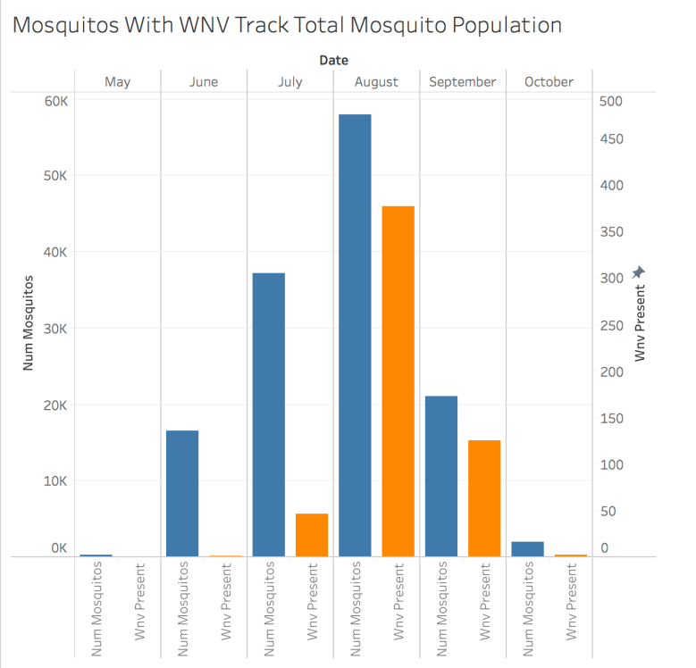
The mosquito observation data was split into a training set and a test set where odd years included columns containing the number of mosquitos and whether or not WNV was present. Every observation included a mosquito count of at least 1, but WNV present represented a minority class (roughly 5% of observations). Comparing these observations in Figure 3, you can see that the number of WNV observation tracks with the number of mosquitos. This relationship could be used to make a better model
One pitfall for making models based on a limited dataset is when circumstances required for a positive observation do not exist in the test data. Our test data includes 7 species of culex mosquito, and WNV only shows up in the majority class. This is problematic, because the WNV can show up in all species of Culex mosquito[1], and our test data includes relatively uniform observations of each subspecies plus an unknown subspecies.

Model
Because we were doing this analysis well after the Kaggle competition completed, we had access to several Kernels that helped give us a basis for our modeling strategy. I think our most successful strategy in feature engineering was done by using a moving average of weather characteristics (temperature, pressure, precipitation, etc.). We did not exclude any features, but depended on Lasso and Ridge Regression methods for feature selection.
Even though we are doing a classifying model, our model actually predicts a probability (a fraction between 0 and 1) that WNV is present. These probabilities are used to score the power of our model, by arbitrarily increasing the acceptance parameter from 0 to 1 and calculating the ratio of specificity to sensitivity. The score is AUC ROC which is the area under the curve of that measurement. Anything better than 0.5 is considered useful. Figure 5 shows this curve

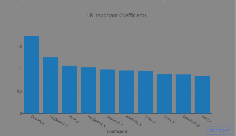
Because we are attempting a classification model (WNV present/not present), we chose first to model using a logistic regression from sklearn. Logistic regression outputs coefficients that directly correspond to normalized features, making it highly interpretable. After tuning with a grid search, figure BLANK shows the top 10 coefficient values from the model. Unsurprisingly unseasonably warm weather is the strongest indicator.
We attempted to fit more complex models, including a nueral network, support vector classifier, and a decision tree with varying results. We expected more complex models would allow for better results, but our AUC-ROC score was still best on the simple logistic regression, and this model performed in the top 20% of competitive entries on Kaggle, so I’m confident in it’s predictive powers.
Recommendation:
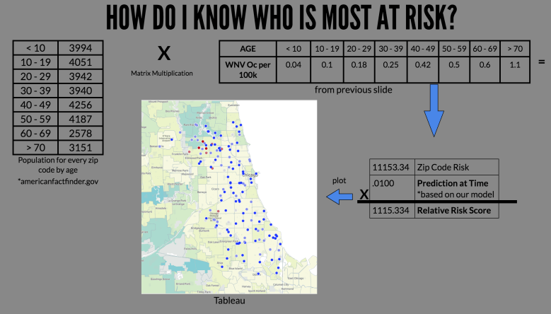
Having developed a model I can be confident in, we have developed a recommendation tool that can be used by government officials to decide where to spend resources for spraying based on the highest risk areas. We determined that the highest risk areas are those with highest populations weighted heavier towards the elderly, as the have a higher risk of being diagnosed with WNV [1].

To create this tool, each location was given a KPI based on the population of age groups in the zip code [3] times the incidence of WNV/100k[1] from Figure 7. By multiplying the model prediction by the KPI, we have a relative risk score for each observation that can be used by officials to determine a cost/benefit analysis when deciding where to spray. A calculation of this KPI can be seen in Figure 8.
While we believe the logic behind these KPI’s is sound, any KPI can be applied to the measurements to weight the risk based on the needs of officials and any new information. Our final product was put into a Tableau Viz that can be easily embedded into a website.
Next Steps:
If this project were to continue, our next steps would be working with officials to improve the predictive model. We would fill in gaps in data (i.e. test years) and refine our KPI based on feedback from lawmakers. Finally, we would study how WNV transfers from mosquitoes to humans to implement the best predictors of outbreaks.
[1] https://www.cdc.gov/westnile/index.html
[2] https://www.kaggle.com/c/predict-west-nile-virus#evaluation
[3]https://factfinder.census.gov/
[4]http://scikit-learn.org/stable/auto_examples/model_selection/plot_roc.html
