It turns out a portfolio piece is never done. There’s still much more to do here, but it’s in a spot where I’m comfortable setting it down and talking about the results, while I focus on other things. I’m really proud of this project, please check out my Tableau Visualizations, as they are awesome.
Problem Statement
Fashion is a $3 trillion industry that we all participate in, whether we like to admit it or not. Fashion trends are often defined by an elite few designers, and access to that world is limited to a limited few. In this project I examine in images from Fashion Shows from the worlds most iconic designers, and use computer vision to single out their clothing. I decompose the pixels and translate them to a “bag of colors” that I define. I run Logistic Regression on my data set, and use the coefficients to determine defining colors for designers, seasons, or even an individual fashion show. By treating my “bag of colors” like a “bag of words”, I can use common natural language processing algorithms (TF-IDF) as another method for defining color that allows for pretty awesome visualizations with minimal pre-processing. Finally, I build a recommender system using a cosine difference algorithm to find individual images that show likeness to one another.
Collecting Data

All of my data was scraped from Vogue.com, a leading fashion magazine with over 100 years of history. The catalogue on their website images from every major fashion show. A fashion show could include a catwalk event, one where a crowd watches as models walk down a runway wearing designer clothes, or a “lookbook”, which is more like a photo shoot. I chose to only use catwalk events. This required me to manually trim my data, which was intensive but provided a few advantages:
- Lookbooks are often highly stylized, the images could include filters on the lens, or props that are not fashion.
- Fashion show images are typically all framed the same, a model is front and center, one foot forward. All the images from a fashion show usually have identical backgrounds.
- This labeling could be used later to algorithmically determine fashion shows from lookbooks.


Lookbook image (left) vs Catwalk Image (right)
Fashion lines are broken up by season and style. Typically, a designer will come out with multiple lines per year, usually at least a Spring and Fall Line. Additionally, a very popular season is the “Resort” line, which comes out in June during international fashion weeks. Additionally, non Resort shows are labeled:
- Ready-to-Wear: (for clothes that could end up directly on shelves,
- “Couture” : For high fashion, generally clothes that would never be worn
- Menswear : Typically Featuring only men, but often a show labeled menswear is identical to a ready to wear show that just features men.
Preprocessing Images
Isolating models with TensorFlow: While fashion show images are nice in that they are mostly images of the model, the majority of the pixels are background and even other people. While I intend to build my own TensorFlow Algorithm to optimize for fashion items, I did not want that to be the focus of the project. I instead used an existing TensorFlow Model called imageAI to detect the fashion model. [2]
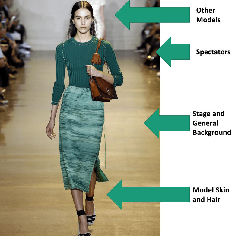
imageAI still had the problem of detecting other humans that may be in the background (other fashion models or observers), but conveniently, the fashion models are the largest thing in the image. I kept the largest file produced by imageAI, assuming that to be the fashion model, and ignored the rest. Upon inspection of my dataset, algorithm has captured the majority of the fashion model every time.

Removing Background with Canny Edge Detection:
After the Images were compressed, and the model framed via TensorFlow, about 40% of the area of the image is still the background. To solve this problem I used a method called Canny Edge Detection in OpenCV. By reducing Noise and Calculating Intensity Gradient, the algorithm labels the pixel containing the edge of an object in an image with a 1 and all other objects as a 0 based on the hysteresis thresholding defined by the user[3].
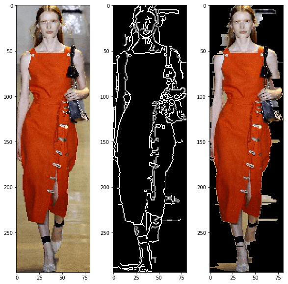
Canny edge detection creates a whole new image. Additionally processing, not provided by openCV, is required to actually get the image of the model in the foreground. Since the canny image shape exactly matches the original, I multiplied every pixel to the left of the first edge and every pixel to the right of the last edge by 0. This produced exactly the results I wanted, with very little of the background left in the image.
A Note on Skin:
The only way to remove skin from images without training a neural network to do so is based on skin tone. Because fashion designers seem to like to use models with an array of skin tones, I did not want to add a process to remove skin on some images and not on others. Additionally, I found sometimes these methods confuse skin and earthtone clothes. The only way I can think to do this is to train a nueral network to identify clothes and ignore skin. This is a goal for my future work.
Color Mapping
Color mapping admittedly belongs in preprossing, it has its own realm of challenges, has the most room to improve, and is admittedly the most fun I had with the project.
To interpolate actual fabric color from pixel color is not a trivial task, even the smallest shadows can change a pixel color on garment that is one color. To reduce the number of pixels extracted from each image, I used a machine learning technique called K-Means clustering [4], a common technique for image compression. Every pixel image was given 20 clusters, a number that could use further experimentation.

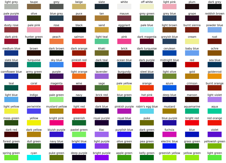
A pixel color is great, but not great for having interpretable results. I would get a strange response telling someone the hot color of the season is [255,0,0], when they would understand much better the clothing is red. I was actually very surprised to find color naming conventions on a computer to be a challenging task. XKCD.com [5] did a survey of over 200,000 people, showing them different colors and asked them to describe colors. The results were enlightening, hilarious, and surprisingly useful. Thankfully, he posted top 954 most common color names along with their hex coded RGB values[6], which I used for naming conventions in my project. To reduce the number of features, I actually chose to use the top 152 colors from this list, based entirely on the biggest box of Crayola crayons available containing 152 unique colors.
To map the colors in my clusters to the named colors, I thought of colors existing in a cube, who’s coordinates are their respective RGB values. I converted the hex values from XKCD to RGB, and used Pythagorean Theorem to compare the cluster center with every color in my dictionary from XKCD, and selected the color with the minimum distance to be the best of the name of the color cluster approximation.
Data Analysis
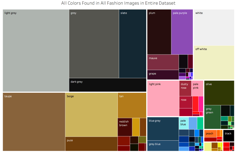
Initial Plotting: Now that I have image colors mapped, I needed to do some exploratory data analysis. I wanted to take advantage of Tableau’s visualization tools on this project, however, getting Tableau to show user specified colors turned out to be its own challenge. To summarize the technique, I created a new “palette” where every color in my dictionary had a value. Again, this was arduous, but totally worth it. My first attempt at a visualization was a tree map with the area of each square being the frequency of color. I took the extra step to group my colors by family.
My next attempt was a circle plot, where the area is the frequency of occurence
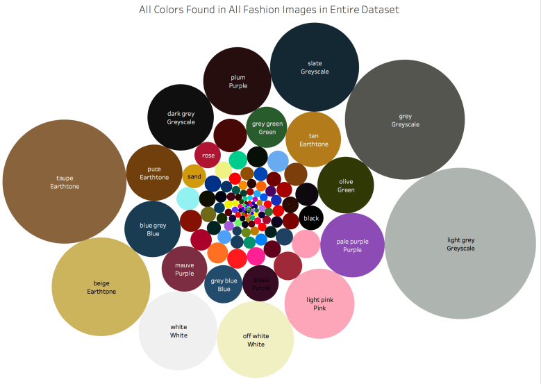
While this is a pretty plot, I was actually disappointed to see that the most frequent colors were the boring ones. The earthtones and greyscales dwarf the interesting colors. And as we know from the movie “The Devil Wears Prada”, fashion is about little details and nuance in color. So how to tease out the details that make clothing special? I will explain two techniques, that gave similar results that I believe to be quality.
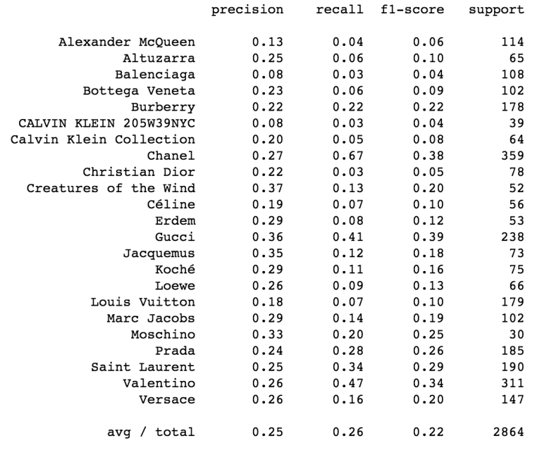
Modeling (With Logistic Regression): My hypothesis for this model is that if I use a logistic regression, splitting evenly among designers and using the frequency of each color as my variables, the coefficients to the colors would be considered the defining colors for each designer. Before I talk about the results (which are exciting!), I will first talk about the data science process and analysis of the quality of my modeling technique.
First, the values were standardized, so that my weights can actually be considered (in order) the most defining colors for the designer.
The main challenge with this dataset is that the classes are unbalanced. Chanel and Gucci will produce over 100 images for a single show and participate in several events every year. Moschino, however, only participates in one show per year and has fewer total images than some designers have for a single event. I ensured to train/test/split with stratify, to ensure that all designers were represented. I then attempted to balance the classes by oversampling each designer. I increased my dataset 10x, and oversampled so that every class had an equal number of images.
I ran several iterations of this model to tun it to improve the accuracy of my model and the best situation scored around 26.4% accuracy, which is phenomenal. If you compare to a monkey throwing darts, he will be right an average of 4% of the time. If he just predicts Channel (the most prolific in the dataset), he would be right 12% of the time. Below is the output of my classification report for each designer. In plain English, precision tells us how the ratio of images for that designer that were incorrectly classified, recall tells us the ratio of images of that designer that were correctly classified, and the f1 score is a balance between the two. In my brief time looking through fashion images, it doesn’t surprise me Gucci performs the best, as their images are some of the craziest I have seen.
Now, for the fun part. Below are the colors with the highest coefficients, the colors, that if present, improve the likelihood of an image being from a designer. This is exciting because I can identify the colors that, if present, are more likely to predict a designer.
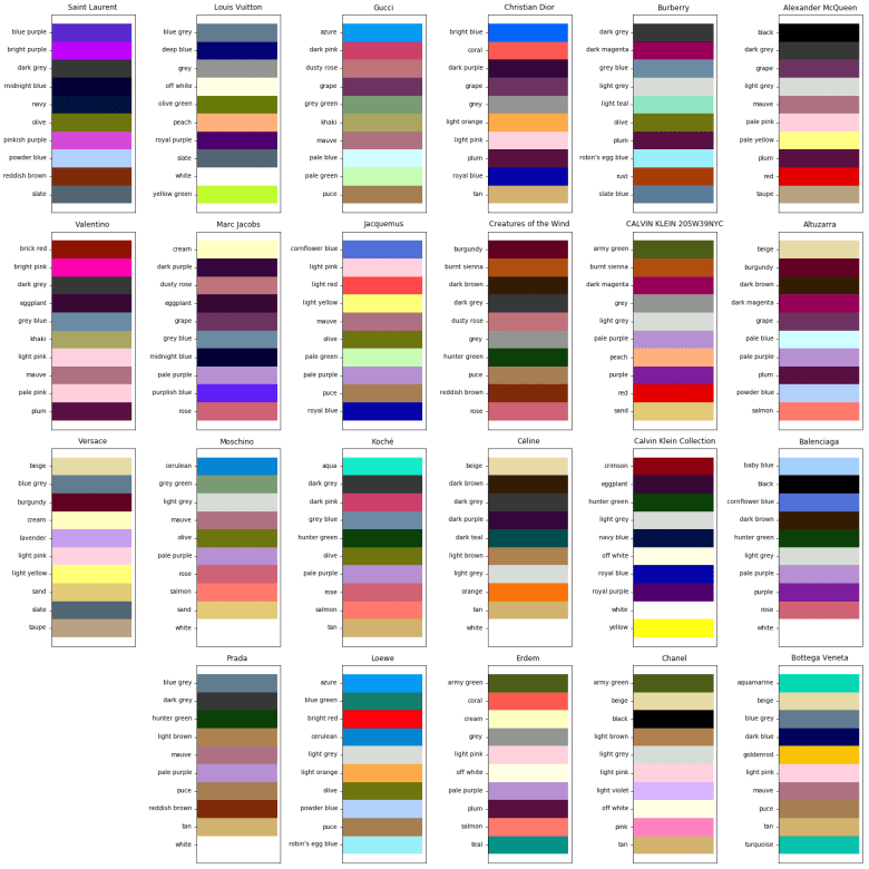
How good is it? I’m not an expert in fashion, and some designers will probably despise being boiled down to a few colors. However, some do identify with a very specific color scheme that they consider iconic. For example, Coco Chanel has been deceased since 1971, but she was well known for her love of gold, red, white, beige and black [2]. Those colors continue to identify the brand, and they turn up as a top coefficients for Chanel.


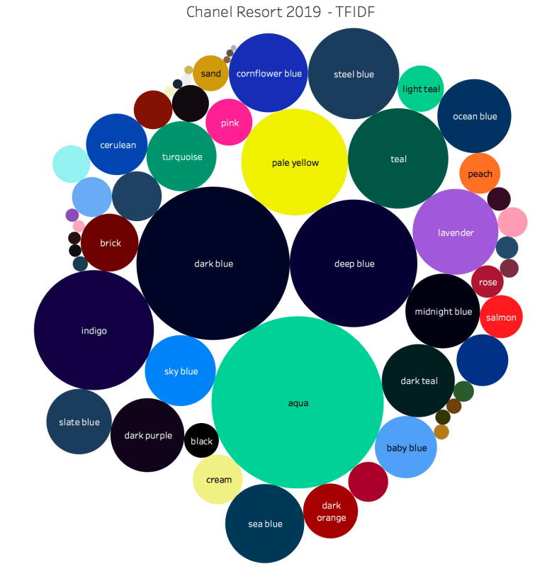
TF-IDF Vectorization
While working on the project, I noticed that my “bag of colors” looks a lot like a traditional “bag of words”, a method for vectorizing text data. TF-IDF (Term Frequency – Inverse Document Frequency) is a methodology that is useful for determining authorship in NLP process, it works by giving a heavier weight to words that appear less frequently in the rest of the corpus. I was disappointed that TF-IDF did not improve my modeling at all, but I found that TF-IDF vectorized weights were highly correlated with the coefficients of the logistic regression. Using TF-IDF weights to show what stands out in a show instead of logistic regression is very powerful because it is much quicker and allows for fashion shows with fewer images to be classified.
Recommender System
Recommender systems using cosine distance similarity is a pretty trivial task with the data in it’s current form, so I decided to take a crack at it. Since I do not have any any feedback in this process, I can only look at a few examples and see how well it did. I took the cosine distance of every image from every other image in the data set, the image at the left is the image that is closest to every other image in my dataset, and the 4 images to the right are the closest matches.

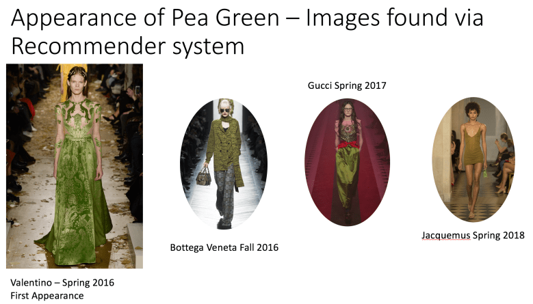
On the surface, cosine distance similarity seems to work pretty well, at least for the case where there are a lot of potential matches. However, it’s much more difficult to find colors that show up less frequently with this method. During analysis of color vs time, I noticed pea green making it’s first appearance in 2016, and then the color appearing several other times in other designers collections in the following years. When I used the cosine distance algorithm, I found that with less frequent colors, the algortihm was more likely to match on skin tone. I did however, find the colors of interest within the first 20 images, under .2% of the overall dataset.
Summary
I presented a method gaining insight into fashion images. I built a model that isolates as best as possible a fashion model from an image and extracts color from the remainder of the image. I used Logistic Regression to predict designers based on information from the image, but more importantly that technique gave me insight to identifying colors of designers. I also built a recommender system using Cosine Similarity to determine which images are most “different”, which gave a map to look through the most interesting images.
More Work to do
There is still quite a lot of work to be done in this project. Here is what I will try next. If you have made it this far, I’m open to suggestions on how I can improve! Please reach out to me by E-Mail Frank@FrankTurnerV.com
Webscraping: Currently, my web scraping algorithm saves images on my computer. The images themselves do nothing but take up space after I extract color from them, and they are easily accessible on the web. In my next iteration I will delete the image from my computer after it has been analyzed in the interest of saving space.
Isolating Clothing: Labeling a color was important for my sanity to make sure I was making visualizations correctly, but is actually not necessary to give it a human a name. Color is a human construct, and even a name can be the result of bias, marketing, or even gender.
Compressing Images: Compressing Images is a good way to improve speed, but so much of fashion seems to be in the little details. In the future, I’d like to improve the speed of my algorithms without sacrificing fidelity of the images.
More Neural Networks:Canny edge detection is useful for segmenting the model, but not great detecting objects. In the future, I would like to train a tensor flow model to detect objects like “dress”, “pants”, and “coat” and extract color from that. I expect I will even be able to remove skin tones in the same manner.
Better Directory System:I’m still new to this whole thing of working with computers and having thousands of items to keep track of and analyze. I really think my directory system could use some work to make looking up things easy and so that every image has one place with all the relevant information in it.
Time Series Analysis: It would be really interesting to predict what colors will be used next season and with what frequency. Visualizing frequency of color is challenging, because some colors are almost always present (eg earthtones), but relative increases are what is interesting.
References:
[1]http://us.fashionnetwork.com/news/The-20-best-fashion-shows-in-the-world-in-September-2017,876882.html#.W0pWcthKiMI
[2]https://www.luxwoman.pt/the-colors-inside-chanel/
